Why, when you sit on the toilet seat, is the hand shower on your right side?
Why is the space bar the largest key on your keyboard?
Why do professional office chairs have wheels and 360 degree rotation?
Why are so many companies searching for UX designers right now?
Did you ever think about it?
All of that is UX. User experience. And most people never notice it, because good UX is quiet. It just works, so you never stop to think about it.
Here is what I believe as a designer. UX is the oldest form of design. Not the newest, the oldest. It matters everywhere, whether you are designing a landing page or designing a washroom for your bedroom. UX matters. And it is the major part that designers ignore.
We think UI is the finish line. It is not. UI is just the ending, the surface. There is a lot more to know about UX if you want to be a great designer. So let me show you the real history of UX, the real story from the very start, and why it runs modern life more than you think.
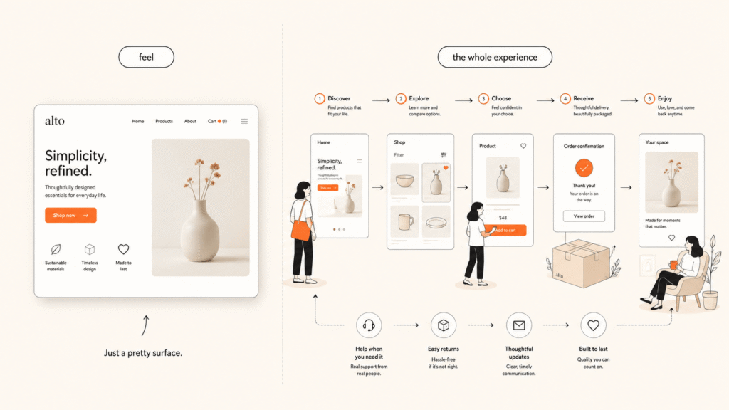
First, what UX really is
UX is not how a thing looks. It is how it feels to use, and whether it actually helps a real person do what they came to do. UI is the paint. UX is the whole house, the doors, the flow, the way you move through it.
A product can look beautiful and still have bad UX. And a plain product with great UX can win. Keep this in your head, because you will see the same idea show up 2,500 years ago.
UX is older than you think
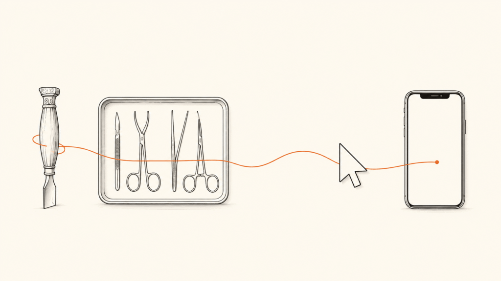
Designing for the human is very old. Many people trace it all the way back to Feng Shui in ancient China, arranging a space so it feels right to live in. And there is a peer-reviewed study showing that in 5th century BC Greece, craftsmen shaped their tools and workspaces to fit the worker. Hippocrates, the father of medicine, even wrote how a surgeon should arrange the room and the tools for the best result.
That is not UX with a screen. That is ergonomics, the old grandfather of UX. But the idea is the same one we use today. Fit the thing to the human, not the human to the thing.
This is what I mean when I say the innovation is the oldest, but the usage is future friendly. We just gave an old idea a modern name.
The industrial age taught us to study the human
Frederick Taylor and the first hard look (1911)
In 1911, Frederick Taylor wrote “The Principles of Scientific Management.” He studied how workers used tools and time, to squeeze out more output. I have to be honest here. Taylor cared about efficiency, not about the worker’s comfort. In many ways it was the opposite of caring about the user. But it started something. People began to study the human and the machine together, and that habit never stopped.
Toyota and respect for people
Then came a warmer version of that thinking. Toyota, building cars in the mid 1900s, built a system around “respect for people.” A worker on the line could stop everything if they saw a problem, and their ideas mattered. People love to call this “early user testing.” That is a bit of a stretch. But the spirit is real. Listen to the people who actually use the thing.
Henry Dreyfuss designs for people (1955)
The real design grandfather shows up in 1955. Henry Dreyfuss, an industrial designer, wrote a book called “Designing for People.” He measured real human bodies, he even drew two standard humans and named them Joe and Josephine, and he designed phones, trains, and tractors around them. One line from him says the whole thing:
“When the point of contact between the product and the people becomes a point of friction, then the industrial designer has failed.” – Henry Dreyfuss
Read that again. That is UX, written in 1955, before the word even existed.
Disney designs a full experience (1955)
The same year, 1955, Disneyland opened. Disney’s team designed the whole visit, the walking paths, the lines, the small details, so people felt the magic. You will read “Walt Disney was the first UX designer” a lot. Careful, that line comes from one opinion article, not from history. But his parks are a real early example of designing a full experience, not just one product.
The life-and-death turning point: a cockpit in World War II
Here is the moment UX became serious. Not a pretty app. A war.
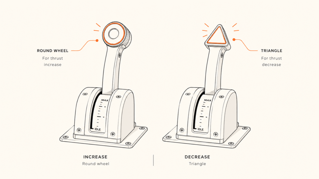
In World War II, American pilots kept crashing planes like the Boeing B-17. Not in battle. On landing. Again and again, a pilot would pull the wrong lever. The control for the landing gear and the control for the flaps sat right next to each other, and they looked and felt almost the same. Under stress, tired, coming in to land, the pilot grabbed the wrong one and pulled the gear up while the plane was still on the ground. The plane dropped onto the runway.
For a long time, they wrote it down as “pilot error.” Blame the human.
Then a psychologist named Alphonse Chapanis looked closer and said something bold. It is not pilot error, it is design error. The pilots are fine. The controls are the problem.
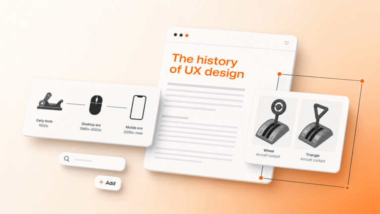
His fix was simple and brilliant. He put a small rubber wheel shape on the landing gear lever, and a small triangle shape on the flap lever. Now a pilot could feel the difference with one touch, in the dark, without looking. The confusion stopped. That same shape-coding is still used in aircraft today.
Think about that. Changing the shape of a handle saved lives. That is UX. This is the moment the world stopped blaming the user and started fixing the design.
The screen changes everything
The Mother of All Demos (1968)
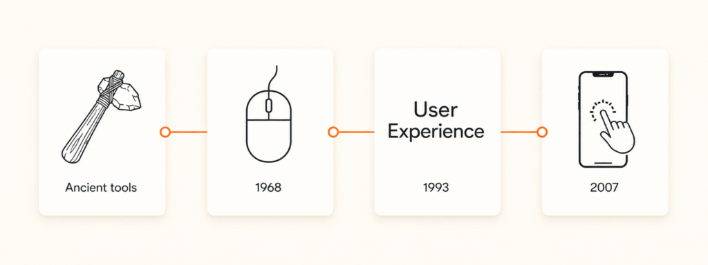
In 1968, an engineer named Douglas Engelbart stood on a stage in San Francisco and, live, showed the world the computer mouse, windows, and clickable links. People later called it “The Mother of All Demos.” For the first time, a normal person could point at a screen and click, instead of typing secret commands. UX moved from the factory and the cockpit into the computer.
Xerox and Apple make it simple (1973 to 1984)
In 1973, the Xerox PARC lab built the Alto, the first computer with the kind of screen we know today, windows and a mouse. Then Apple. Steve Jobs saw the Xerox work, and Apple brought it to normal people, first the Lisa in 1983, then the Macintosh in 1984. Get one thing right here, because most articles get it wrong. Apple did not invent the graphical screen. Apple made it simple enough for everyone. That is a different job, and honestly a harder one.
Finally, the name (1993)
For all this history, the words “user experience” did not exist yet. That came in 1993, when Don Norman, a cognitive scientist, joined Apple and took the job title “User Experience Architect.” Probably the first person to ever put those words on a business card.
One honest thing, because I care about the real story. Norman did not invent the term. He says so himself, and he gives credit to Brenda Laurel, who used it earlier. He gave it a name and a job, and pushed it into the world. Norman also wrote the book every designer should read, The Design of Everyday Things. My favorite line from him:
“Good design is actually a lot harder to notice than poor design, in part because good designs fit our needs so well that the design is invisible.” – Don Norman
That is why you never think about the toilet shower or the space bar. Good UX is invisible.
And Jakob Nielsen made it measurable
Around the same time, Jakob Nielsen turned usability into something you could measure. His 10 usability rules, made in 1990 and refined in 1994, are still used today. In 1998, Nielsen and Norman started the Nielsen Norman Group, and UX became a real profession with a name and a method.
The revolution in your pocket (2007)
Then 2007. Apple launched the iPhone and put multi-touch in everyone’s hand. Pinch, swipe, tap. No manual needed. A child could use it. Apple did not invent multi-touch, but they made it simple enough for the whole world. After that, UX was not a niche job anymore. It was everywhere, in every pocket, every day.
Why UX runs modern life now
So here we are. And this is the part I really want you to feel.
UX is the most advanced and the major part of modern life. Without UX, everything is valueless. It does not matter if it is a digital product or a physical product. UX matters everywhere in the world, in every business, in every part of your life. Most of us do not even notice how deeply UX is tied to our daily life.
Your website is your shop. Your app is your staff. Your chair, your car, your phone, your kitchen, all of it is UX. When it fits you, life feels smooth and you never think about it. When it fights you, you feel annoyed and you do not even know why.
Steve Jobs said it in one line:
“Design is not just what it looks like and feels like. Design is how it works.” – Steve Jobs
That is the whole point. Not the look. How it works. And the master of less himself, Dieter Rams, gave designers the north star:
“Good design is as little design as possible.” – Dieter Rams
So, did you ever think about it?
Now go back to my first questions. The shower on your right when you sit. The space bar being the biggest key, because your thumb lives there. The office chair with wheels, so you move without standing up. Someone designed all of that around you, the real human. That is UX. It was always UX.
Charles Eames put it in one line that every designer should tape to the wall:
“The details are not the details. They make the design.” – Charles Eames
UI is the ending, the surface you see. UX is everything underneath, the part that decides if your life feels easy or hard. The innovation is the oldest. The usage is future friendly.
Why UX matters for your business
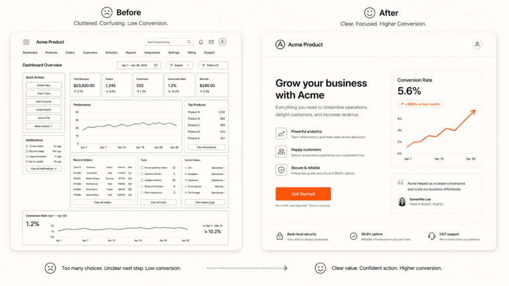
Now let me talk to the founders, the CEOs, and the product managers. Because this history is not just a nice story. It is money.
Here is the simple truth. Every point of friction between your product and your customer is a lost sale. Dreyfuss said that in 1955, and it is still the most important sentence in business. When your product is hard to use, people do not call support and complain. They just leave, and they buy from someone easier. You never even see them go.
This is not a soft, feel-good thing. McKinsey studied 300 companies for five years and found the ones that took design seriously grew their revenue about 32 points faster than their rivals. That is why companies are searching for UX designers. They finally understand that UX is not decoration, it is growth.
In my own work, this is the whole game. When I redesign a product page, I do not start with the color. I start with the real user. What they are trying to do, where they get stuck, what makes them leave. On average, that focus has lifted conversions by around 35 percent on the pages I revamp. Same traffic, same product, more sales. The only thing that changed was the experience.
So how do you actually turn better UX into more conversion? It splits into two worlds.
1. Physical product or business
For a physical product or a shop, UX is the whole journey, not just the item.
Make the product obvious on the first try, so nobody needs a manual. Every second of confusion is a customer who feels stupid, and people do not buy from a thing that makes them feel stupid. Design the buying journey too, the shelf, the packaging, the store layout, the checkout line, the unboxing, the return process. Remove the friction at each step. A shop that guides you to what you want sells more than a shop you get lost in. A product that just works earns trust, and trust is what makes people buy again and tell their friends. In the physical world, good UX feels like good service, even when no person is there.
2. Digital product or business
For a website, an app, or a SaaS, conversion lives and dies on the experience.
Start with one clear job per screen and one clear action. Cut the steps. Every extra field, every extra click, every slow second is people dropping off before they pay. Make it fast, make it mobile-first, because most of your visitors are on a phone. Write clear words, not clever words, so a tired person understands in one read. Add the trust signals, real proof, clear pricing, an easy way out, so the visitor feels safe to act.
And do not guess. Watch real behavior. Tools like Microsoft Clarity show you exactly where people rage-click, where they scroll and give up, where they leave the form. Fix those exact spots and the numbers move. That is how you get more conversion without spending a single extra dollar on ads. You are not getting more traffic. You are wasting less of the traffic you already have.
Both worlds follow the same 5,000 year old rule. Fit the thing to the human, not the human to the thing. Do that, and the business grows. Ignore it, and you leak money you will never see.
So if you want to be a great designer, or run a great business, stop ignoring the oldest form of design. Start with the human. That is where design always began, and it is where it will always win.
Frequently asked questions
Don Norman popularized it as a job title at Apple in 1993. He did not invent it, and he credits an earlier use by Brenda Laurel.
The name is from the early 1990s. The practice is far older, through human factors in World War II, and ergonomics that goes back to ancient tools.
No. UX is in physical products too, chairs, cars, doors, rooms. Anywhere a human meets a thing, there is UX.
Yes. McKinsey found design-led companies grew revenue about 32 points faster than rivals, because every point of friction is a lost customer.